New this month: New keyboard shortcuts, better search and a bunch of side panel improvements
Product updates
31 Oct, 2025

It’s been a busy month at GitBook. We kicked it off by getting the whole team together at our company offsite, where we worked on new ideas, discussed priorities and planned upcoming launches. Since then we’ve released a ton of great features — so let’s dive in and find out what’s new for October.
Upgraded side panels
First up, we’ve made a bunch of small improvements to the side panels in the app that help you work with and manage your content — across change requests, comments and version history. Here’s what’s new:
Change requests filtering
First off, it’s easier than ever to find the change requests that are relevant to you with new filter controls in the change requests side panel.
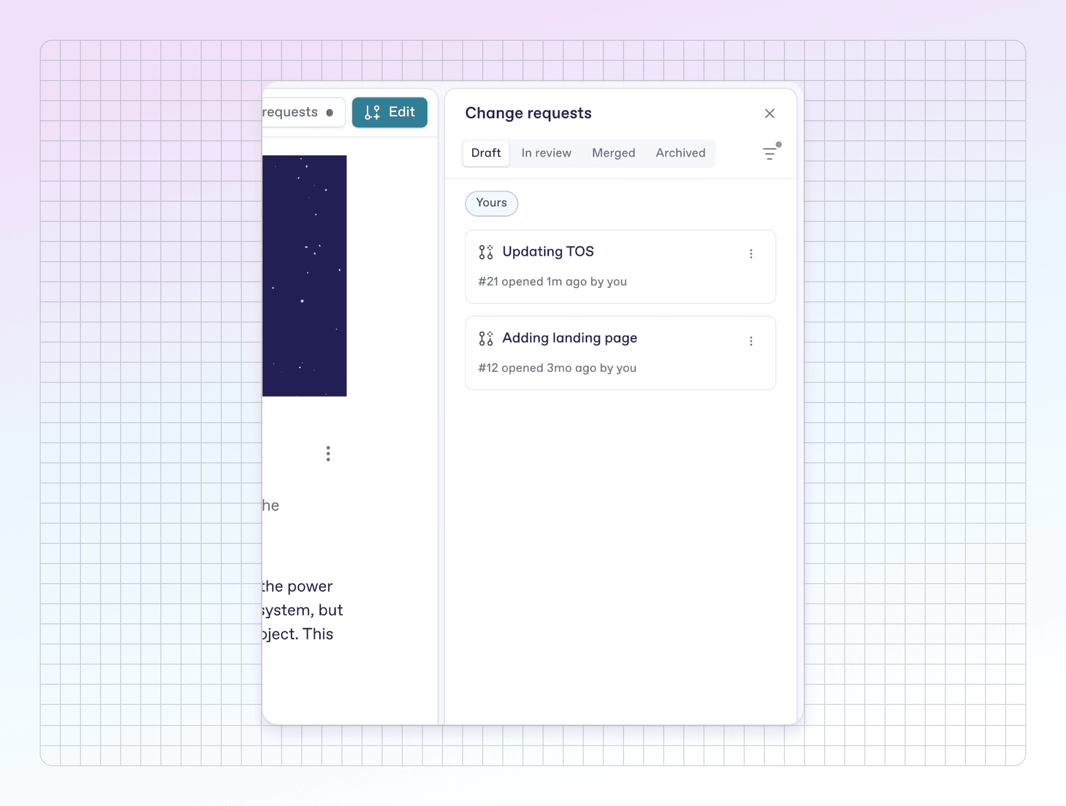
You can use the filters to view change requests by their creator or participants, making it easy to see reviews that you created or contributed to in just a couple of clicks. Combined with the tab views, this is super powerful.
Better comment threads
We noticed that the comments side panel could become quite long if you and your team had longer conversations in threads — as threads would always display in full.
To save space and make comments more browsable, threads don’t display by default any more. Instead, threads now open in their own view when you click on a conversation in the sidebar — giving each conversation more space and making it easier to find the feedback you need.
We’ve also added a new Expand side panel button to make the whole panel larger — perfect for longer or more detailed discussions.
More precise version history
We heard from some of you that the relative time (e.g. ‘7 hours ago’) in the version history panel made it difficult to know precisely which version you wanted when browsing back in time.
To remedy this, you’ll now see a specific time and date next to each entry in the version history panel, making it easier to find the version you want when browsing back in time.
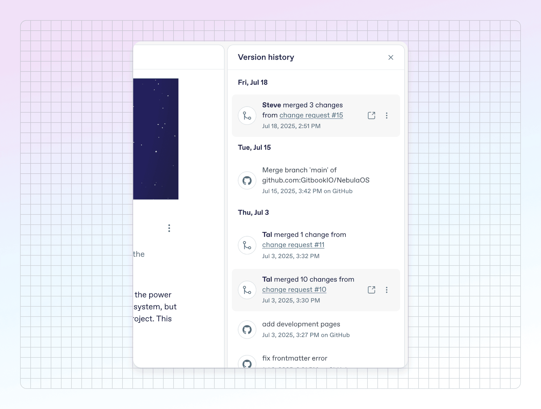
We also made the rollback confirmation menu clearer about what will happen if you choose to roll back to a previous version.
All these sidebar improvements contribute to our longer-term goal — to make our app experience the best it can possibly be.
New keyboard shortcuts
We’ve also got some new keyboard shortcuts to speed up your editing workflow.
First up, a fast way to duplicate one or more blocks. Simply hit ⌘ + D (on Mac) or Ctrl + D (on Windows), and the selected blocks will be instantly duplicated below the selection.
Alternatively, you can also hold the Alt key and drag-and-drop the block(s) you’re duplicating to your preferred place.
Quickly switch text block styles
Along with block duplication, there are new shortcuts that let you quickly switch a text block between paragraph, H1, H2 and H3. Simply click anywhere in the block and hit one of these shortcuts to switch it:
We’ve added a few new keyboard shortcuts that let you quickly switch a text block between paragraph, H1, H2 and H3. Simply click anywhere in the block you want to switch and hit one of these shortcuts:
Turn into paragraph: ⌘ + ⌥ + 0 (on Mac) or Ctrl + Alt + 0 (on Windows)
Turn into heading 1: ⌘ + ⌥ + 1 (on Mac) or Ctrl + Alt + 1 (on Windows)
Turn into heading 2: ⌘ + ⌥ + 2 (on Mac) or Ctrl + Alt + 2 (on Windows)
Turn into heading 3: ⌘ + ⌥ + 3 (on Mac) or Ctrl + Alt + 3 (on Windows)
These are great when you’re writing new content or reformatting pages with new headers to break up content. We’ve been using them a ton already!
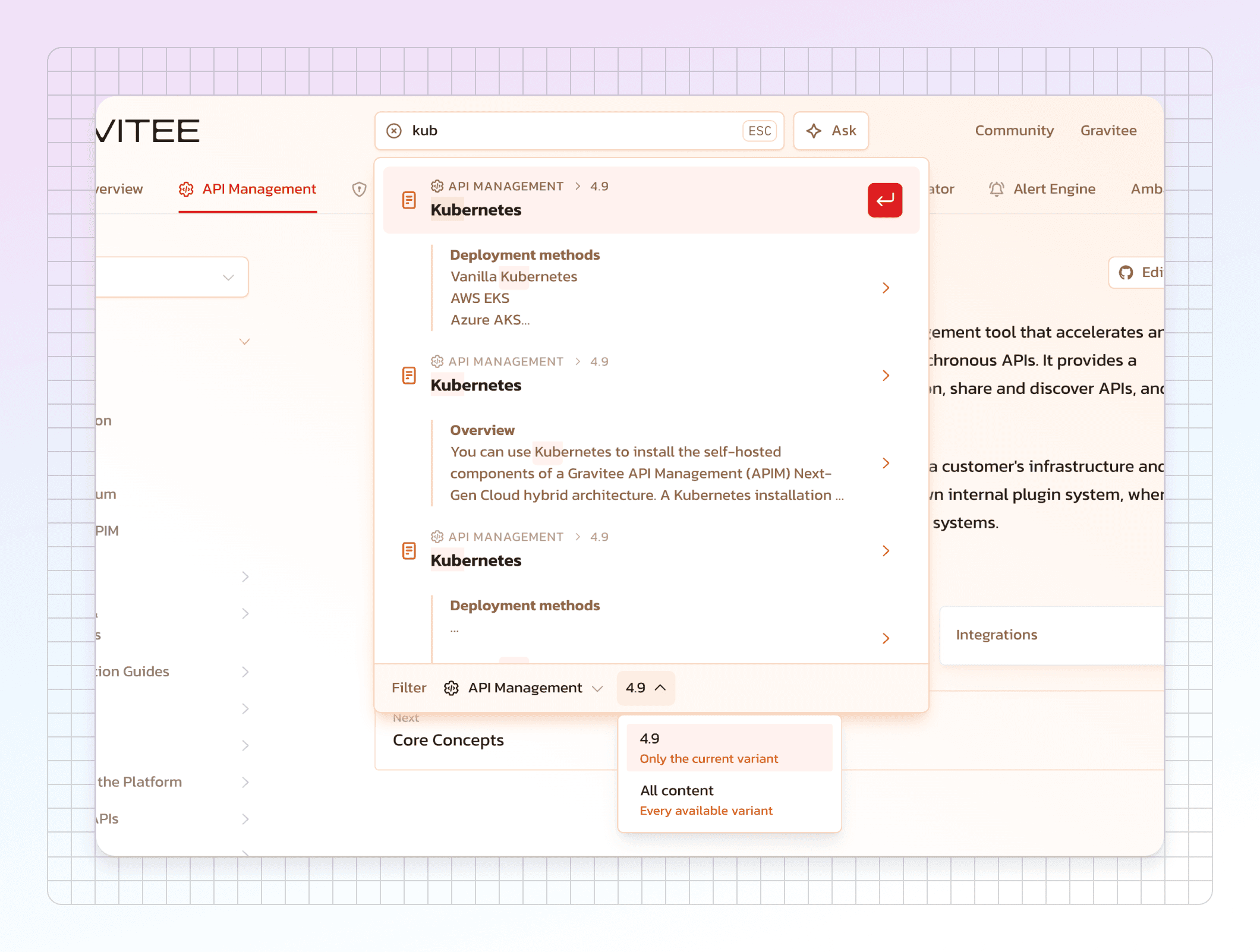
Search improvements
This month we’ve also made a few improvements to site search on your published docs site. The updated search makes it easier for your users to find what they need:
First, sites now support type-ahead search queries — so your users will see relevant results even if they don’t finish the word they’re typing.
There are also improved search filters. We heard from you that our filters were a little too attention-grabbing — so we’ve moved them to the bottom of the search modal so users can filter by site section and variant.
Expandable code blocks
Long code blocks are often valuable in documentation — but they can take up a lot of vertical space on your page.
So this month, we’ve introduced expandable code blocks, which can be expanded or collapsed whenever your users want.
In the editor, simply open the code block’s Options menu and enable Expandable. The block will show the first 10 lines of code, with a button to expand to show the rest.
Editor improvements
That was one particularly awesome editor improvement we wanted to highlight. But our team has been hard at work making a bunch of other improvements across the editor, too. Here’s a quick breakdown of what’s new.
Make images stand out with frames
Image blocks are great for showing off your product, but sometimes the image can blend with the background of your site, potentially confusing users.
To combat this, you can now add frames to image blocks to give your images a consistent look and visually separate them from their surrounding content.
To add a frame, hover over the image, open the Options menu and enable the With frame toggle.
More accessible cards
We’ve added the option to add alt text to cover images within cards — so you can make your docs even more accessible. Plus, don’t forget that you can now add cover images for dark mode in cards!
Instantly view or download files from blocks
If you’ve added a file to a page using a files block, you can now quickly view or download the file from within the editor with a click. New context-aware buttons will appear on the file block itself when you mouse over it, showing all your options.
Better-looking OpenAPI blocks
We’ve improved the way OpenAPI pages display in the editor. Titles, pagination buttons and the OpenAPI banner are now aligned with the rest of the content, and the page outline uses space more efficiently. It’s subtle, but your OpenAPI pages now look better than ever in the app.
That’s not all…
That’s just a short recap of this month’s standout releases. But we shipped more than we can fit here — so head over to the changelog to read about everything else that went live in October.
→ Get started with GitBook for free
→ Last month’s updates: Generate MCP servers from your docs, plus merge rules and more
Authored by

Latest blog posts
Get the GitBook newsletter
Get the latest product news, useful resources and more in your inbox. 130k+ people read it every month.

12 Jun, 2026
5 ways to improve your technical writer skills for 2026

Sarah Dugan
Docs Lead

5 Jun, 2026
Humans are still the real readers of your documentation
Sarah Dugan
Docs Lead

4 Jun, 2026
New this month: GitBook Agent in your editor, AI insights go deeper, and integrations in reusable content

Suzy Everist
Product Marketing Lead
Build knowledge that never stands still
Join the thousands of teams using GitBook and create documentation that evolves alongside your product
Build knowledge that never stands still
Join the thousands of teams using GitBook and create documentation that evolves alongside your product
Build knowledge that never stands still
Join the thousands of teams using GitBook and create documentation that evolves alongside your product

© 2026 Copyright GitBook INC.
440 N Barranca Ave #7171, Covina, CA 91723, USA. EIN: 320502699
© 2026 Copyright GitBook INC.
440 N Barranca Ave #7171, Covina, CA 91723, USA. EIN: 320502699