GitBook in motion: How we reinvented the GitBook brand
Product updates
17 Dec, 2025

If you’ve visited our website recently, you’ve probably noticed that it’s had a major upgrade. Not only have we redesigned every page — we’ve also rolled out a new, modern brand for GitBook that marks a new chapter for our team and our product.
It’s not just a visual refresh. It reflects what GitBook is today.
Documentation is never done. Products never stop evolving, teams are always shipping, and knowledge constantly moves. It branches, merges, gets refined, and pulled forward with every decision a team makes.
We wanted our brand to be a representation of that movement — as well as our own steps to push documentation forward.
Brand concept summary: Living knowledge

We’ve mentioned this a few times recently, but it bears repeating here: documentation today is not a static set of pages.
The knowledge contained within your docs is shaped by product changes, user feedback, support conversations, and team insights. It’s non-linear, interconnected, and constantly in motion.
And that knowledge doesn’t sit statically on the page, either. It’s referenced and reformatted by AI engines, embedded into products, and used to answer support questions. Product knowledge flows in and out of your docs constantly.
And your documentation become more valuable not when it grows bigger, but when it becomes clearer. Every edit matters, and small improvements compound as you build a living knowledge system.
With our new identity, we wanted to make that idea visible and tangible through design.
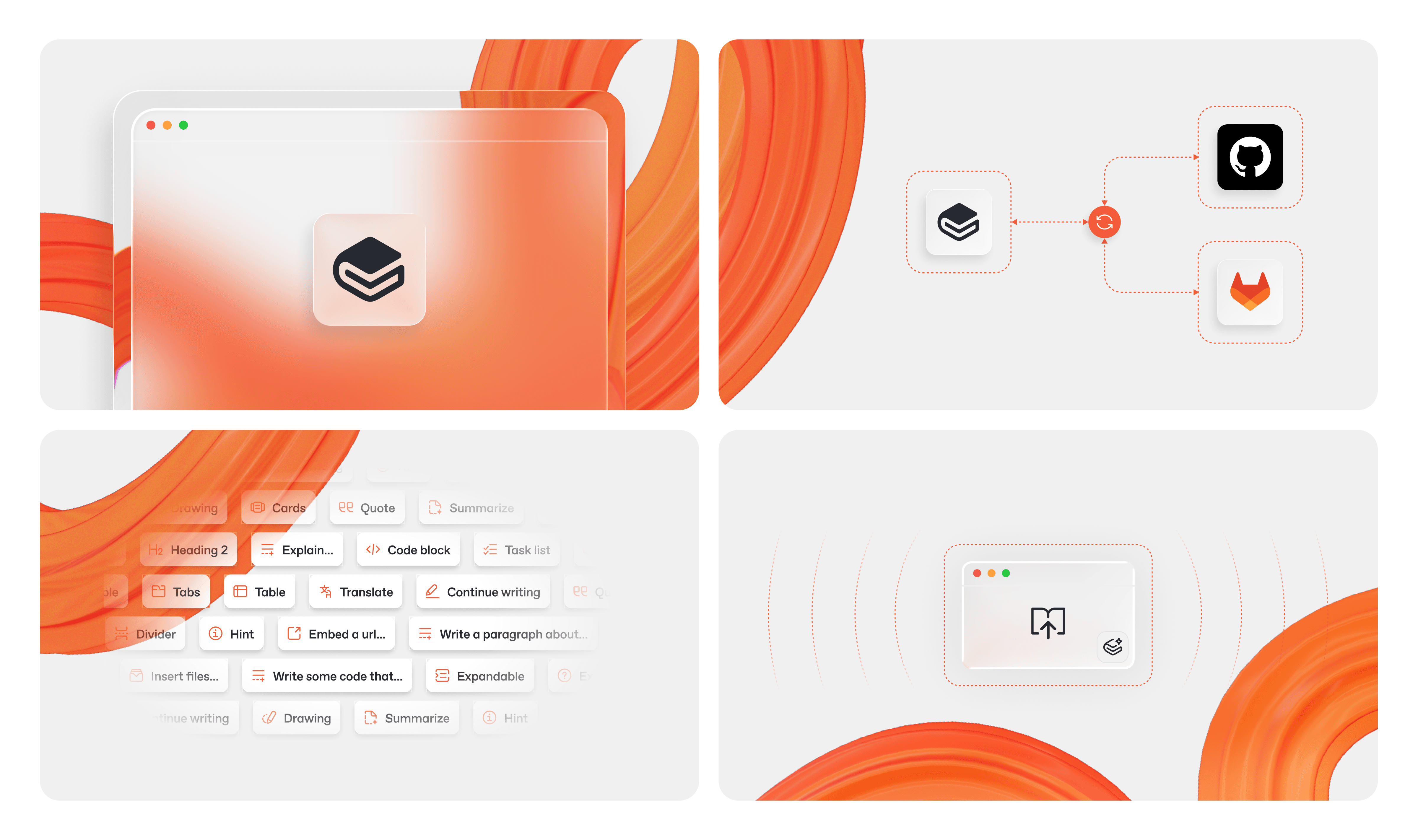
How it started
GitBook has evolved significantly over the past few years, and our brand evolved alongside it. But over time, incremental changes weren’t enough.
Our old brand started with colorful gradients on dark backgrounds, with pastel colors adding highlights to the dark grays. As we added more AI features to GitBook, we wanted branding that felt fresh, but still familiar.
We made our color gradients more vibrant, and the backgrounds became lighter. And at that point we had two similar, but separate visual languages — but no single, coherent perspective that brought it all together under the GitBook banner.
So, to compliment the launch of GitBook Agent, we set ourselves a challenge — build a new, modern brand that told the story of what GitBook is in the modern documentation landscape.
Tuning down the noise and designing for motion
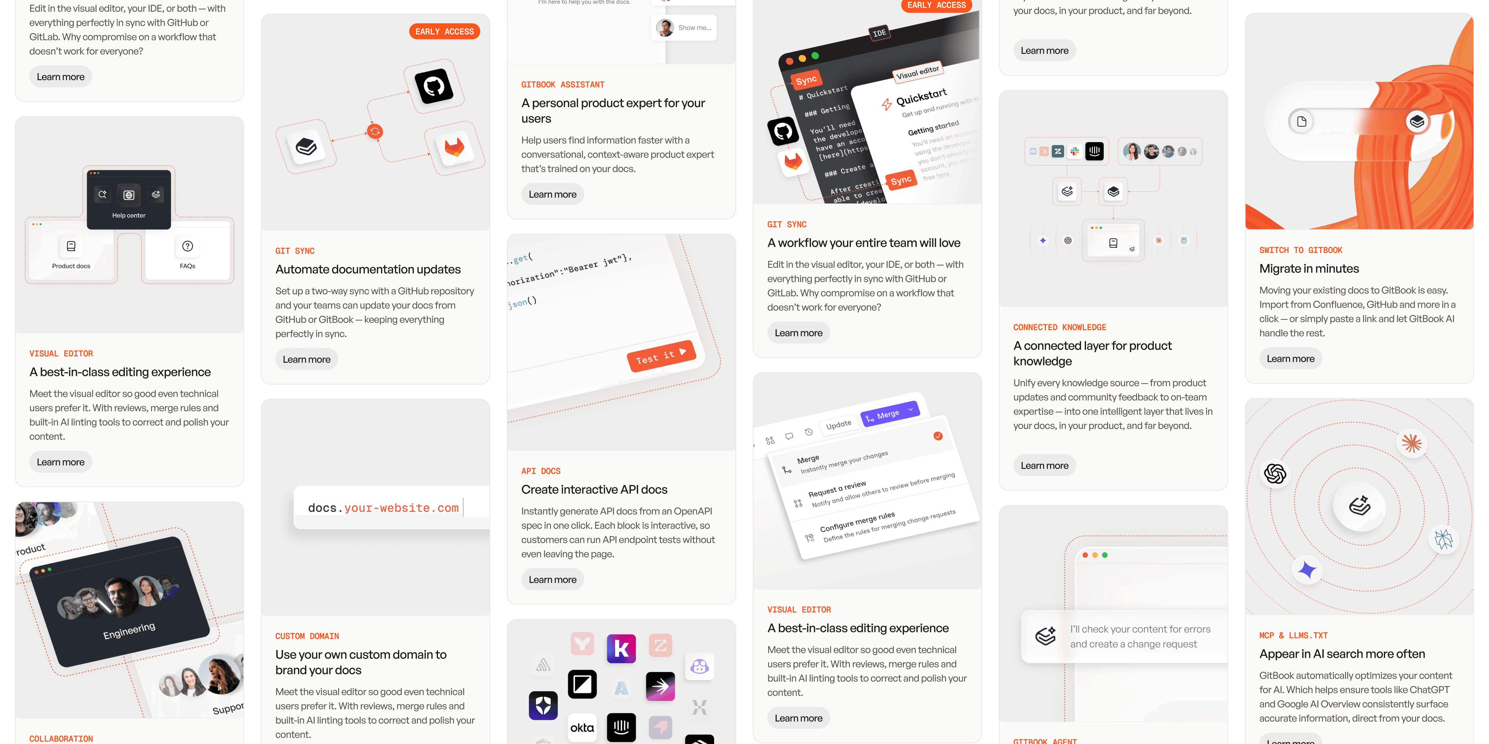
We started by stripping things back.
Before, we’d sometimes used four or five colors in a single gradient. It was bright and attention-grabbing, but it was also noisy and distracting.
So we started by reducing the colors, gradients, and visual noise to create a calmer, more focused canvas. The goal was simple: let the product speak for itself. The brand should guide, not compete for attention.
At every stage we asked ourselves whether our work was expressing the core idea behind GitBook: documentation that moves.
We tested evolutions of our existing gradients and color system: pinks, purples, and softer variations. While familiar, the results felt incremental — they just weren’t bold enough. GitBook as a product has taken huge leaps forward in the last 12 months, and our brand had to do the same. The change needed to be decisive.
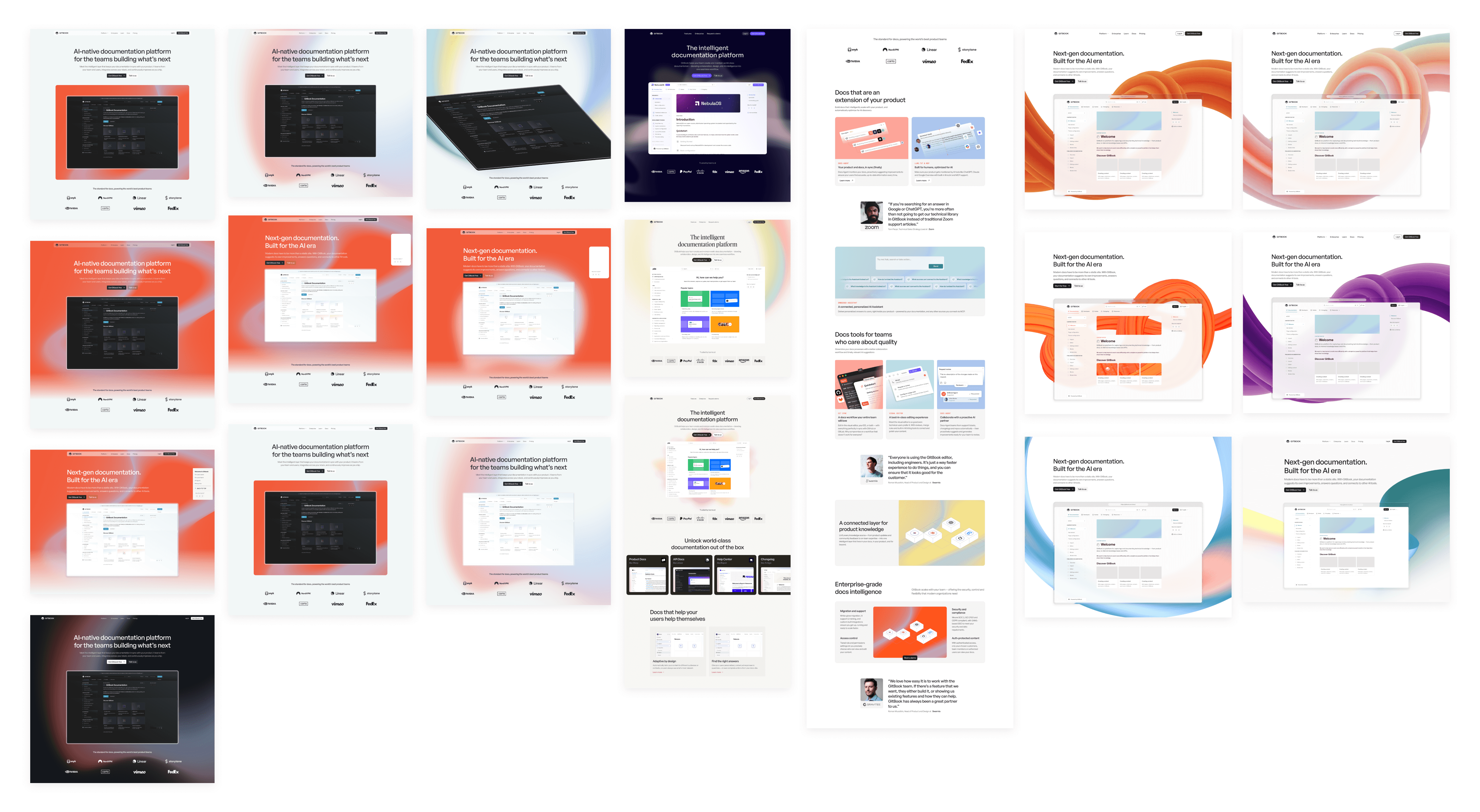
From gradients to dimension
Documentation isn’t linear any more. It’s shaped by many inputs at once: product changes, user feedback, support tickets, internal discussions. Knowledge evolves, branches, and reconnects over time.
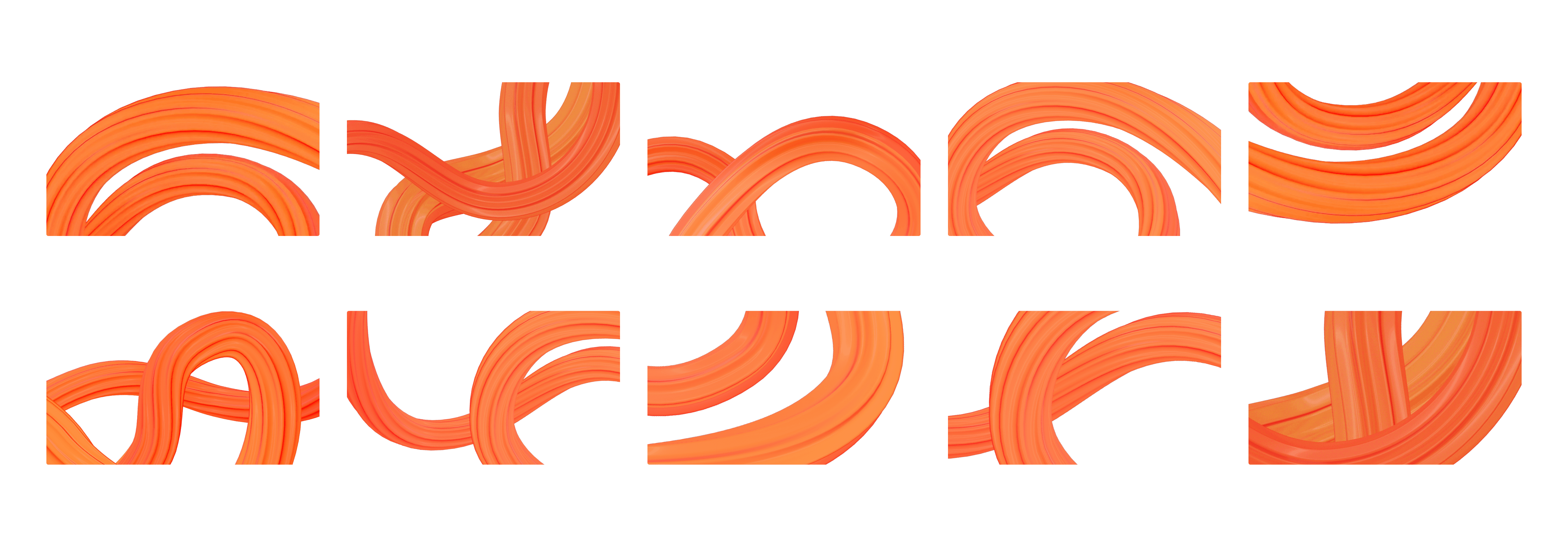
The new 3D ribbon is a visual metaphor for that reality, a living thread of knowledge pulled forward as teams build. It’s continuous, non-linear, and always in motion.
This is why the identity lives in 3D. Not as a styling choice, but as a reflection of how we believe documentation actually works today.
Another important consideration was our typography. Our old font family, ABC Favorit, had great personality but didn’t feel modern enough for our new brand. So we switched to General Sans to better match where GitBook is today: mature, focused, and built for clarity.
General Sans is rational and structured, but still has warmth — so it supports a minimal foundation while carrying the brand with confidence.
Color as signal
The final — and arguably most important — choice was our primary brand color. Before, we used teal, which was an evolution of the blue that GitBook used since its original release in 2014. It worked with our old gradients, but it wasn’t strong or bold enough to be the primary color for our reduced, focused palette.
After testing a range of colors, we chose orange because it behaves like a signal against a calm, minimal system.
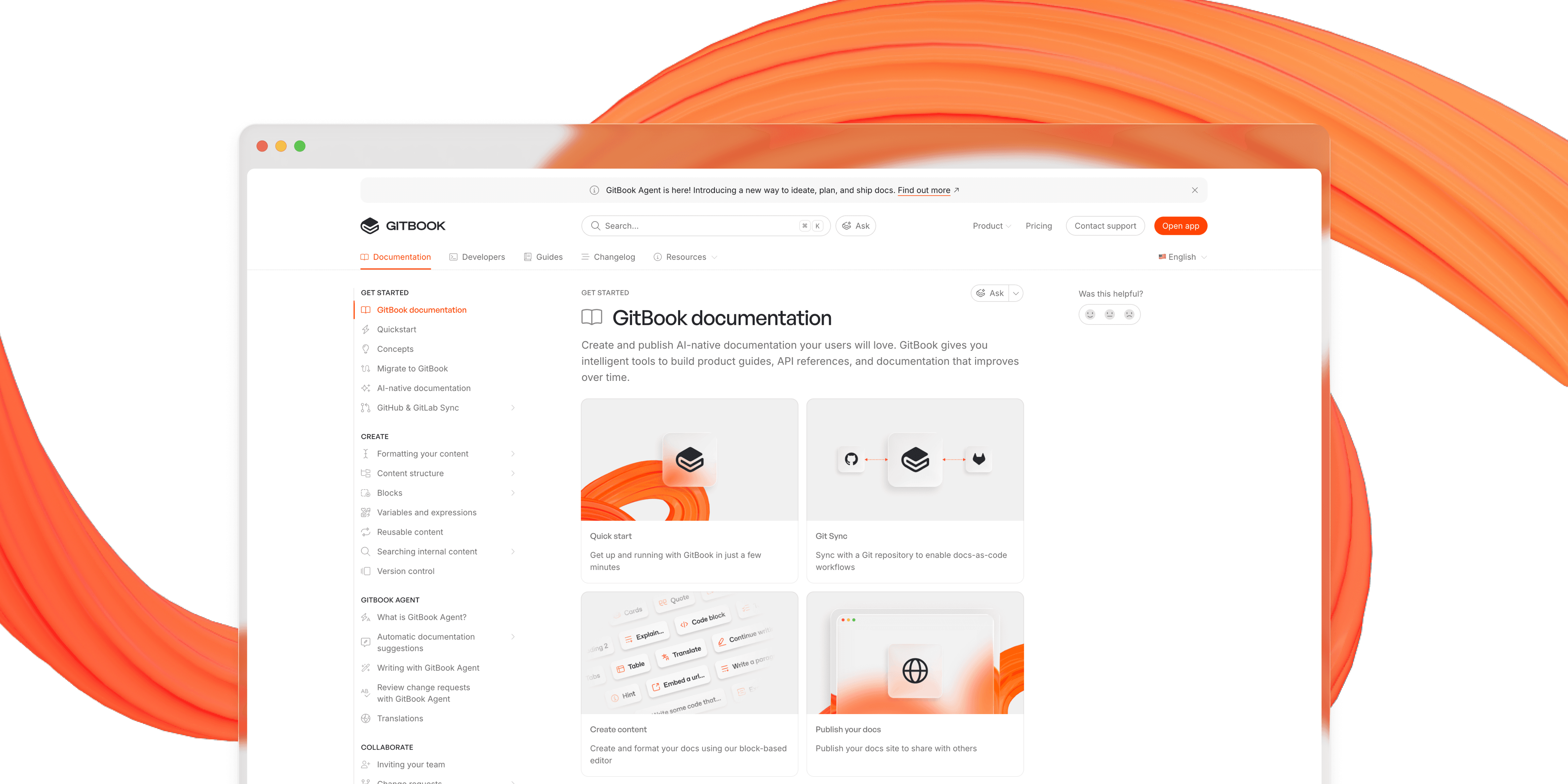
With orange as a bright and bold primary color, we made sure everything else was intentionally subdued — to create focus and clarity, and avoid distraction. The result is a brand that feels vibrant without being too loud, expressive without overwhelming the product.
This new identity is already live across gitbook.com and our documentation — take a look around and let us know what you think.
Carefully considered product changes
Inside the product, we’re approaching changes more carefully.
The product is where you spend most of your time with GitBook, and every adjustment matters. For now, we’ve made some smaller changes to reduce the teal and add a few flashes of orange. We’ll roll out bigger brand updates there more gradually, with the same focus on clarity and usefulness that underpins GitBook as a whole.
What we’re ultimately shipping with this rebrand is a statement of what GitBook is today, and how the documentation landscape is changing fast.
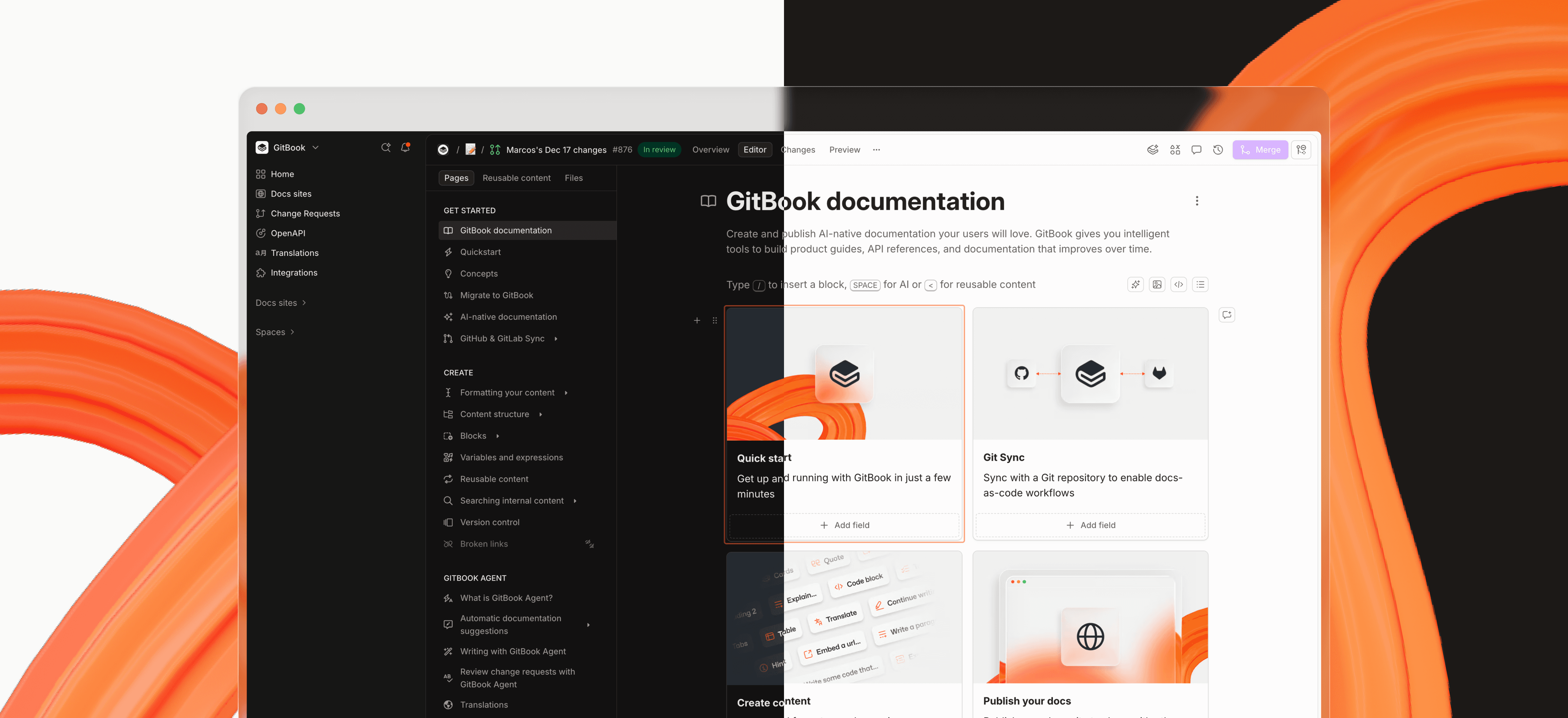
At GitBook we aren’t just adapting to the changes — we’re driving them. And as we build the future of documentation, we’re proud to have a brand that reflects that vision.
Author
Latest blog posts
Get the GitBook newsletter
Get the latest product news, useful resources and more in your inbox. 130k+ people read it every month.
Build knowledge that never stands still
Join the thousands of teams using GitBook and create documentation that evolves alongside your product
Build knowledge that never stands still
Join the thousands of teams using GitBook and create documentation that evolves alongside your product
Build knowledge that never stands still
Join the thousands of teams using GitBook and create documentation that evolves alongside your product


